

Branding

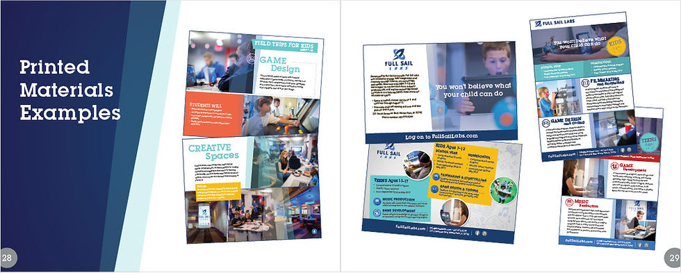
FULL SAIL LABS
We were tasked with creating a brand from scratch that aligned with the mission of providing students with a transformative educational experience through Summer Camp programs focused in STEM. The rocket is a symbolism of exploration and reaching for the stars. We tried to create visuals that were fun, bright, and attractive to kids and teens, while also appealing to parents.


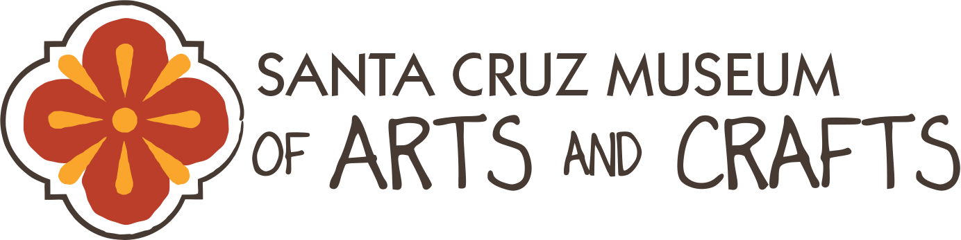

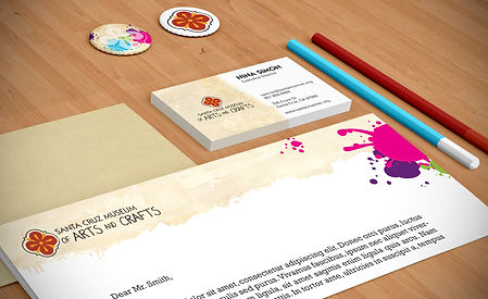
SCMAC REBRAND
The city of Santa Cruz has an amazing history that leads back to when Spaniards conquered the area. This history is represented through the depiction of Spanish tiles which also illustrate the idea of great craftsmanship and art. Santa Cruz Museum of Arts and Crafts needed a logo that represented the goal of the museum better. The current logo is a simple yet stark red circle with the words “MAH” inside. This doesn’t say anything about the museum, what it does, or what it stands for. Warm colors, smooth lines, and painterly look provide the brand with a sense of comfort and friendliness.


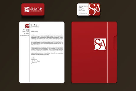
SHARP ARCHITECTURE
This logo and stationery were designed for an architect starting his own company. He wanted something that was a combination of structure yet finesse achieved by incorporating a fluid typographical design inside a square.

BEHAVIORAL ESSENTIALS
Using the E3 Behavioral Insight Platform, can hire smarter, create teams that better understand themselves and each other, and ultimately grow your business as direct result. The logo reflects the different extremes that come with personality assessments through the angles and carefully crafted curves to form a B inside and E.


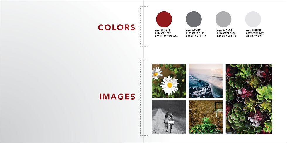

STRONG FINISH COACHING
When a Boston Qualifier came to us with her vision to support runners chasing their own qualifying dreams, we knew this brand needed to embody both grit and grace. We built her brand from the ground up, creating an identity that connects with the running community and reflects the dedication it takes to reach the finish line.